
Sorted | Mobile App Development
A waste sorting app to reduce waste and simplify recycling/composting.
Despite California's efforts to reduce landfill waste, recycling and waste sorting processes remain complex and frustrating for many. The profound environmental impact of human actions underscores the urgent need to simplify and clarify waste sorting, ensuring accessibility and understanding for all.
Role: User Research, UX/UI Designer
Tools: Figma, FigJam, Miro, Adobe Creative, Google Suite
Timeline: 4 weeks
Process: Research, Ideation, Prototyping, and testing
THE PROBLEM
Our goal is to empower environmentally conscious individuals and the curious with informed waste-sorting decisions. Additionally, we seek to enhance their education, promote brand awareness, and incentivize sustainable choices.
HOW MIGHT WE?
Enhance and consolidate current recycling and composting information to empower people to recycle more efficiently and confidently, fostering a sense of environmental stewardship for future generations?
THE GOAL
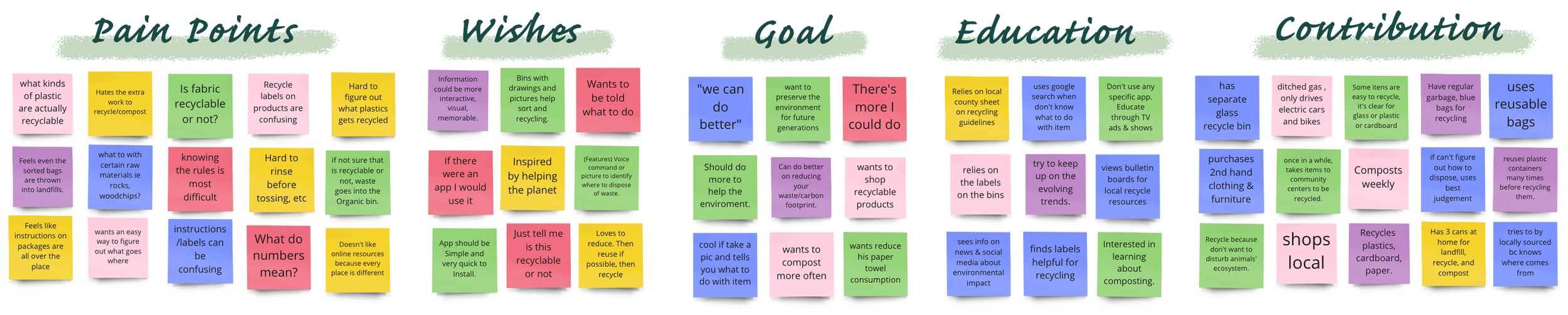
I used quantitative and qualitative research in the form of an online survey and 1 on 1 interviews to collect data. The primary purpose is to understand more about our app's prospective users and their pain points. We discovered that while people care about recycling and composting, they don’t do it consistently due to varying factors, such as difficulty in obtaining sorting instructions, guidelines varying drastically by location, and frustration with individual impact on the environment - if they are doing it right or even enough.
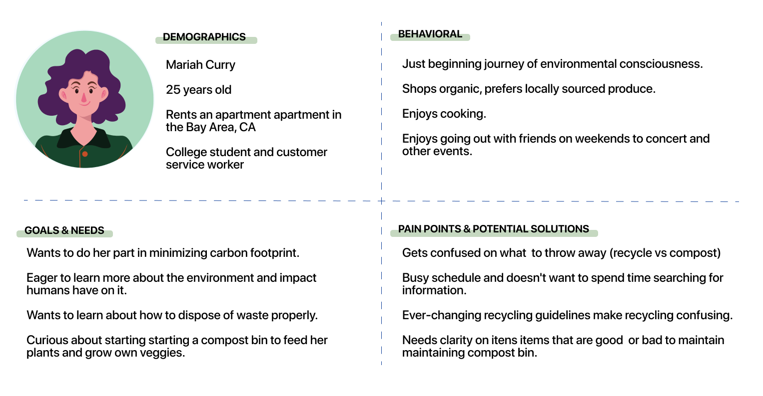
I created a Proto-persona to provide a starting point for evaluating ideas and early design hypotheses, it also helps our team to have a silhouette of our target users.
-
30 individuals ages 25-44 were surveyed.
-
86.7% rated recycling/composting as essential or very important.
60% never compost or rarely compost.
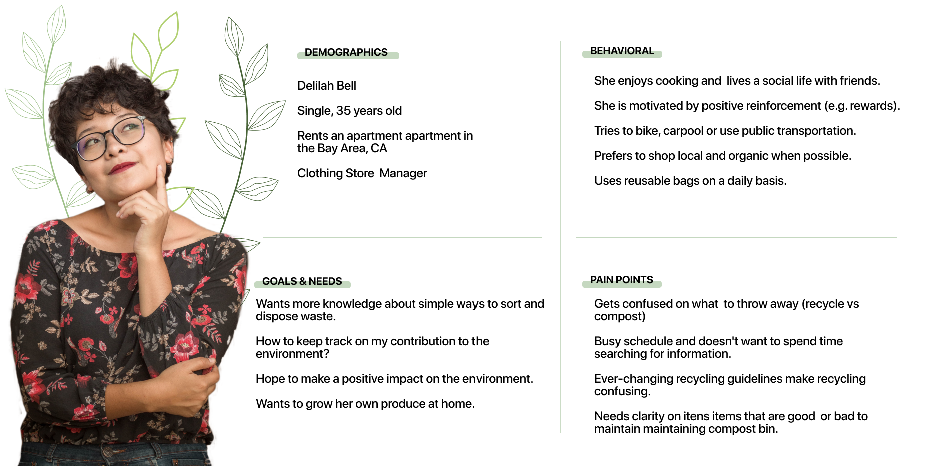
Based on our interviews and insights gathered, I derived our user persona, Delilah bell, a 25 year old female, who is new to the sustainability journey, hoping to reduce her carbon footprint by cooking more at home, using public transportation, and recycling/composting every chance she gets.
Delilah needs access to up-to-date information on waste sorting to stay motivated in doing her part for the planet.
I organized our user insights using sticky notes, and collaborated via Miro. Organizing the insights by groups help me understand what is important for users, their behaviors and pain points.
USER RESEARCH
The ideation phase was framed around the problem statement in an effort to tackle the pain points of our users. We emphasized divergent thinking to target as many ideas as possible.
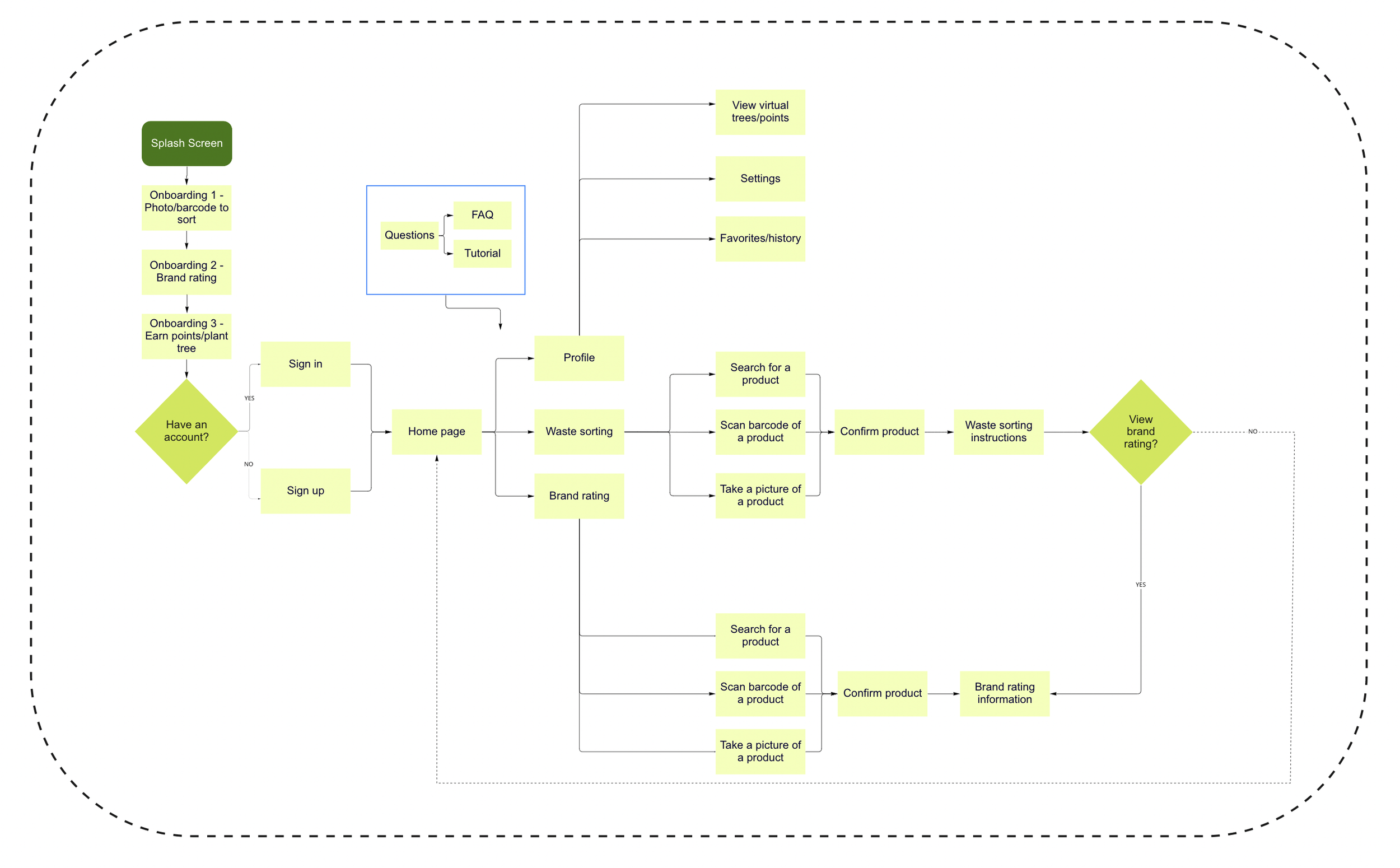
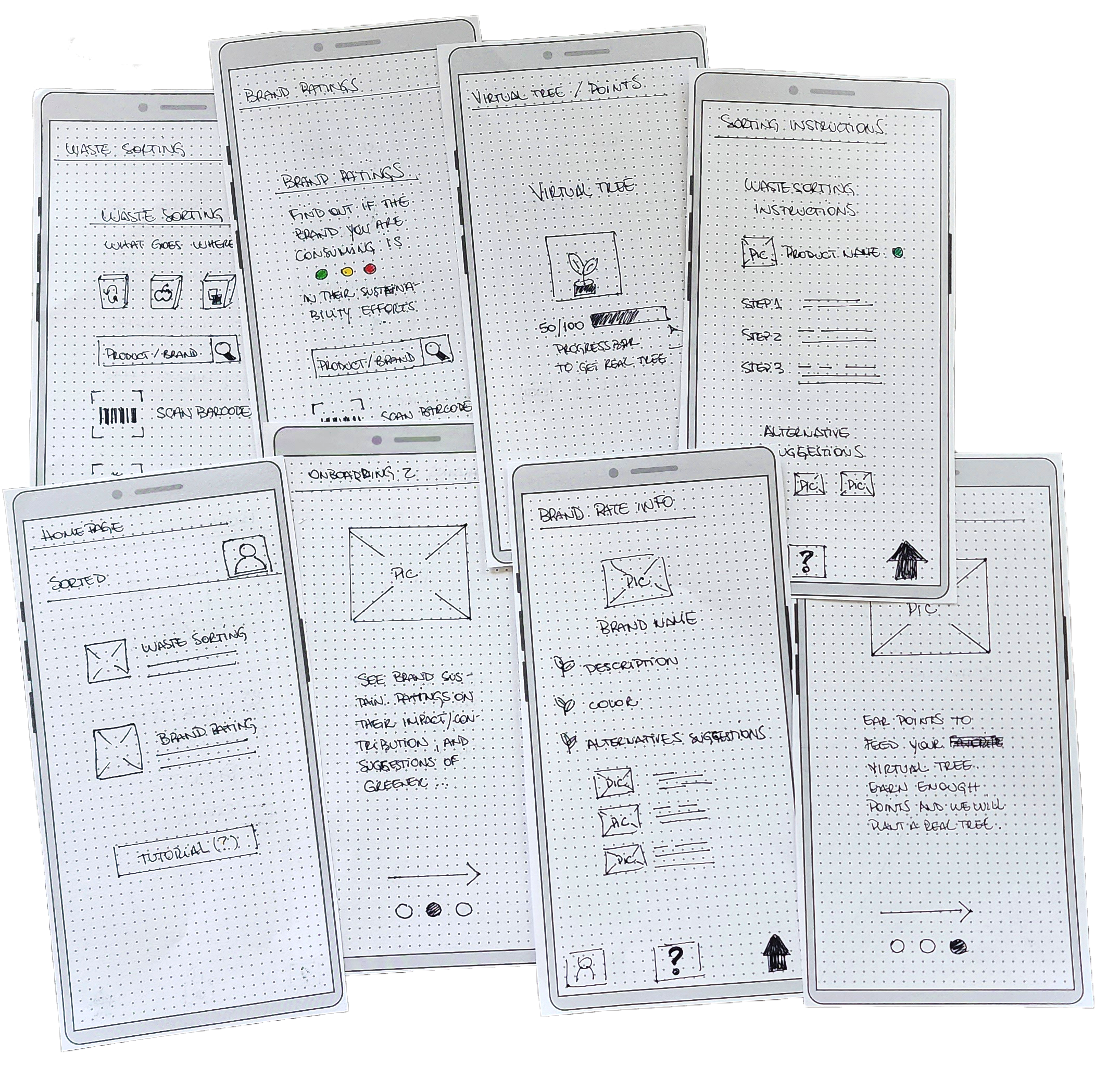
The rough sketches were translated into wireframes, a visual guide that would form the skeletal framework of the app and help me determine the structure and navigation patterns of the platform.
The simplicity of the wireframes allowed me to iterate quickly and test features without being distracted by the appearance.
-
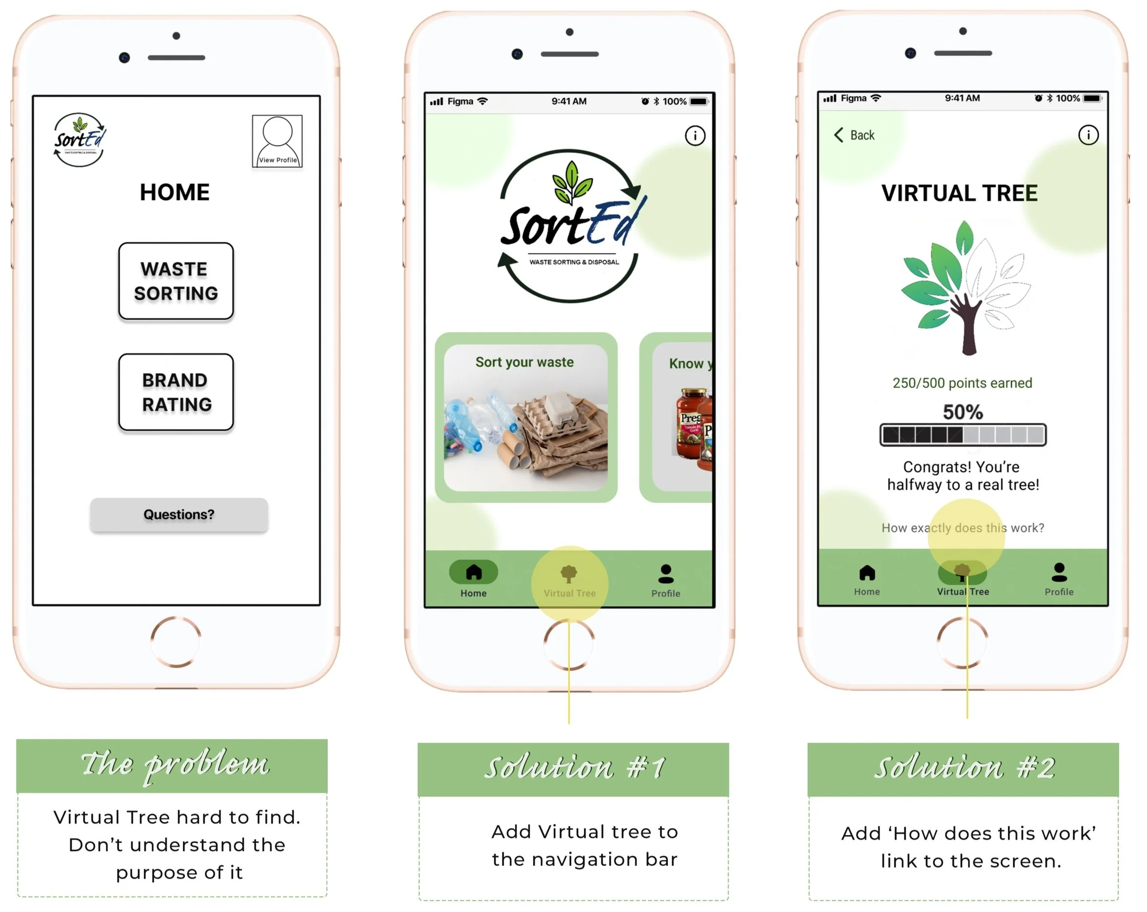
Are features in SortEd easily accessible to new users?
-
Individuals in their mid-20s to mid-40s.
-
#1 : Find virtual tree.
#2 : Scan a barcode.
#3 : Take a photo.
During this process, I could explore and analyze my target audience's behavior when interacting with my design - which is often different from how I think they should use it.
80% of the users were able to complete all tasks.
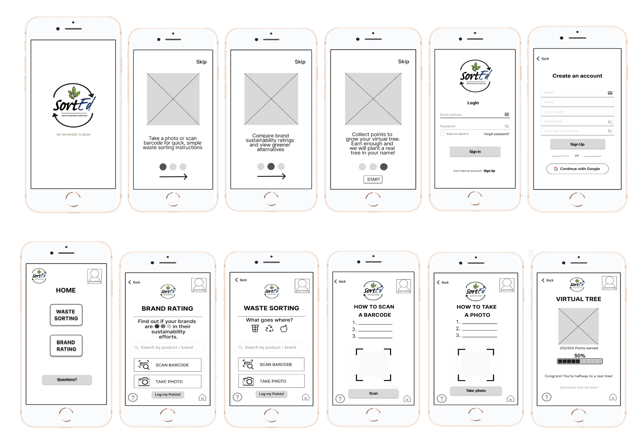
Next, I turned the wireframes into a Lo-Fi prototype - the first visual representation of my design. It allows me to develop my ideas rapidly, put the design to the test, and iterate through many versions in a short space of time without draining much in the way of resources
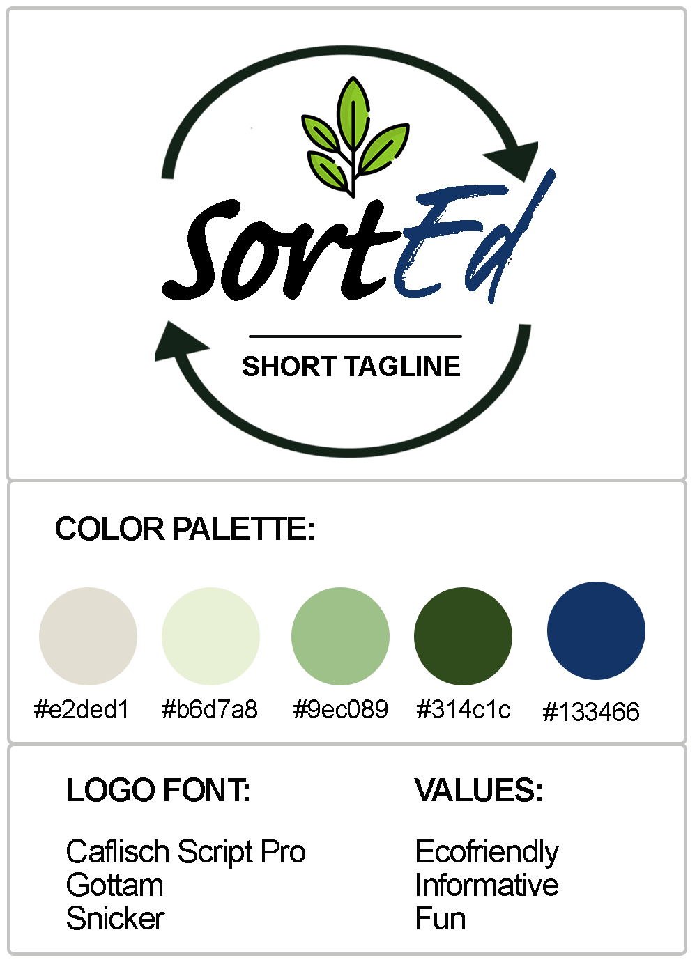
Proper color use is vital for creating a positive image for our users. It stimulates all senses by delivering a message instantaneously, like no other method of communication.
I put together a basic UI to iterate my design following user feedback. I use green in our logo and branding to strategically communicate a level of care for the planet. We added the color blue, which brings a sense of reliability, helping the product seem trustworthy.
DEFINITION & IDEATION
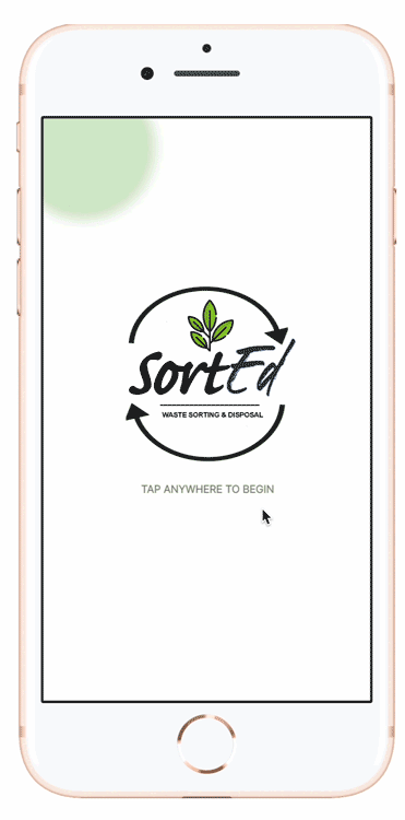
ONBOARDING
FEATURES
user insights
basic UI
Iterations Mid-Fi
Mid-Fi Prototype
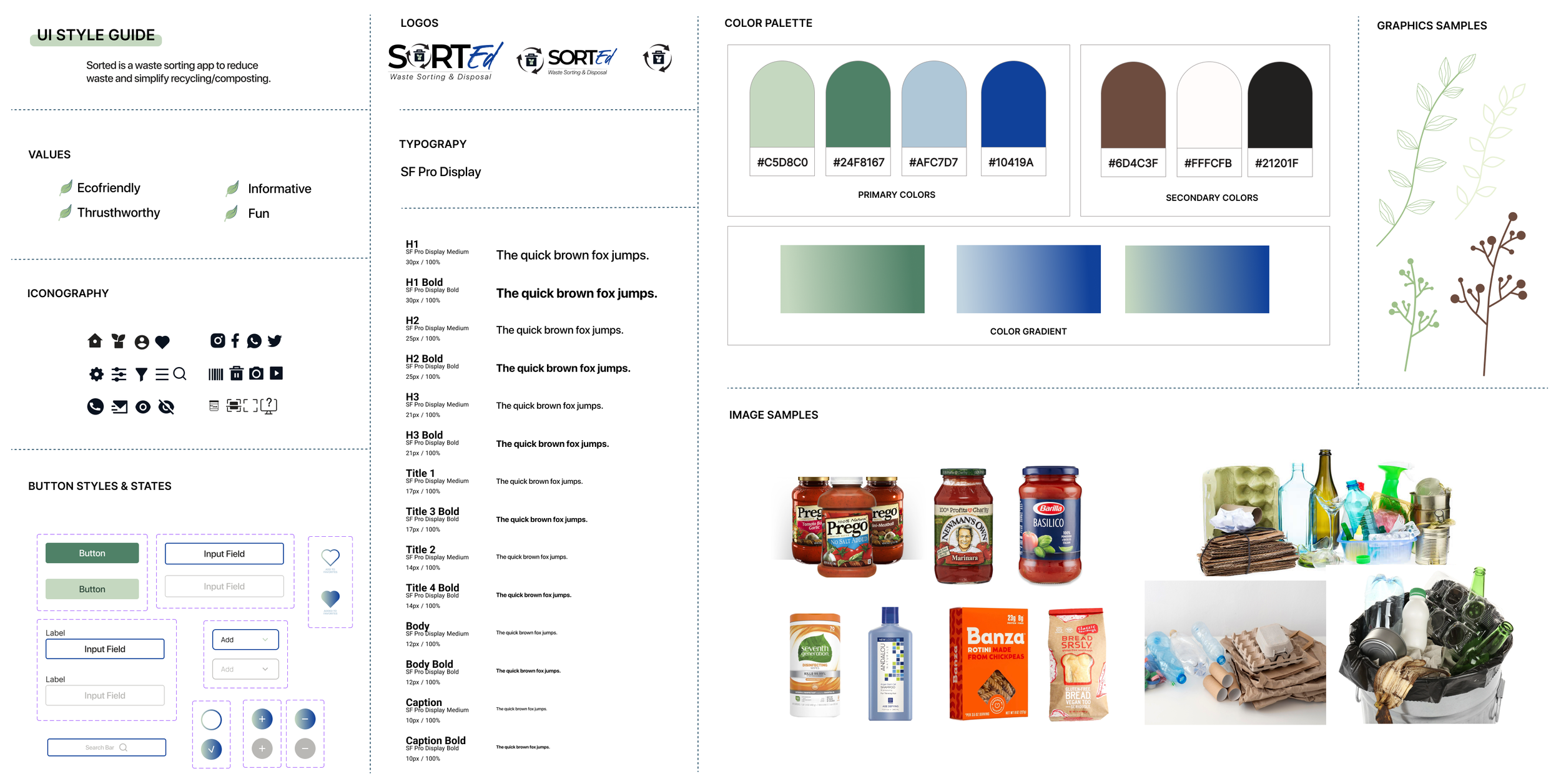
After a second round of tests, I developed a UI Style Guide that contains the necessary details related to your product's user interface, which ensures continuity throughout the product's design. It helps define elements like typography, colors, layout, and components that are approved to be used in accordance with brand guidelines.
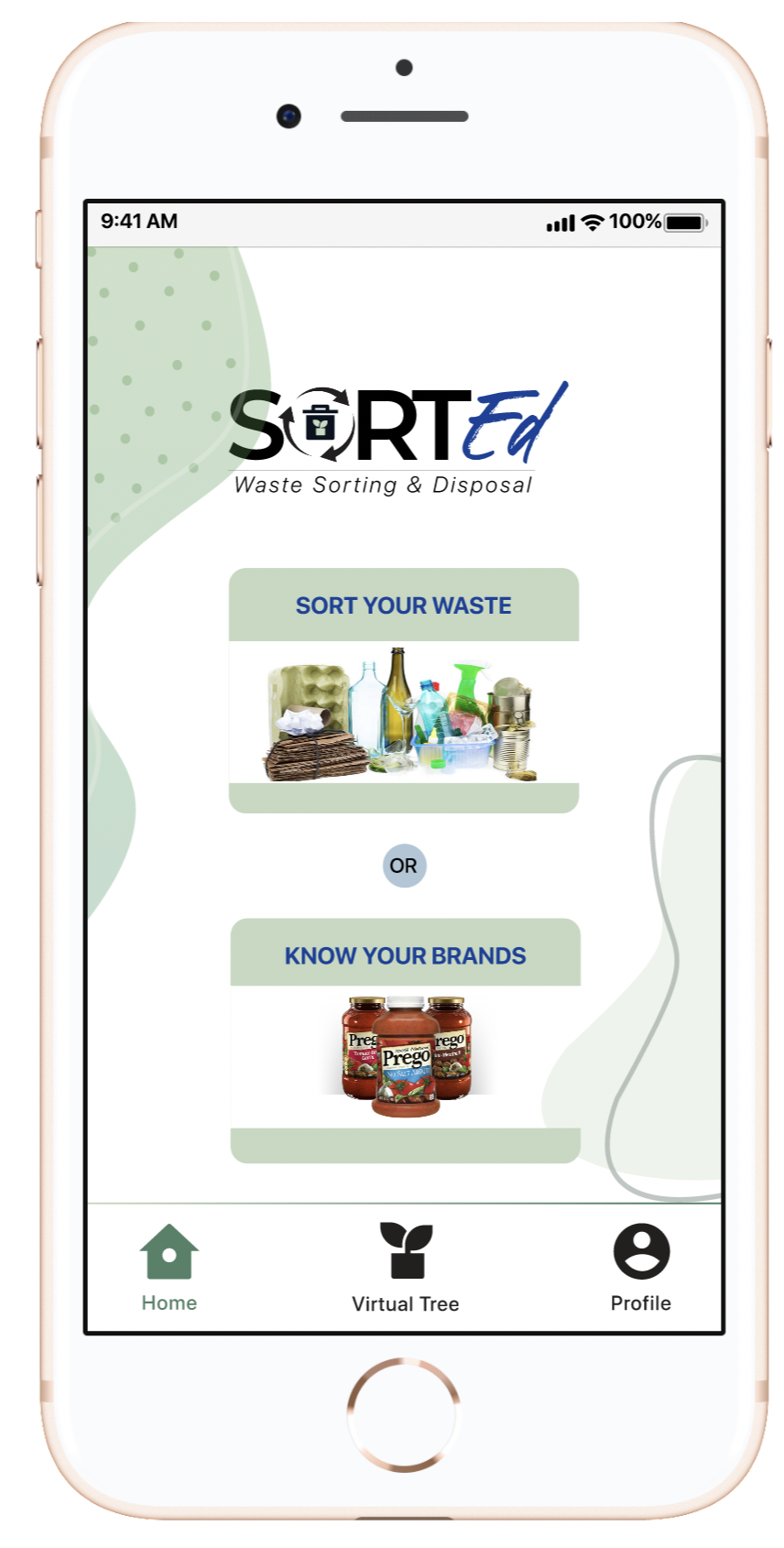
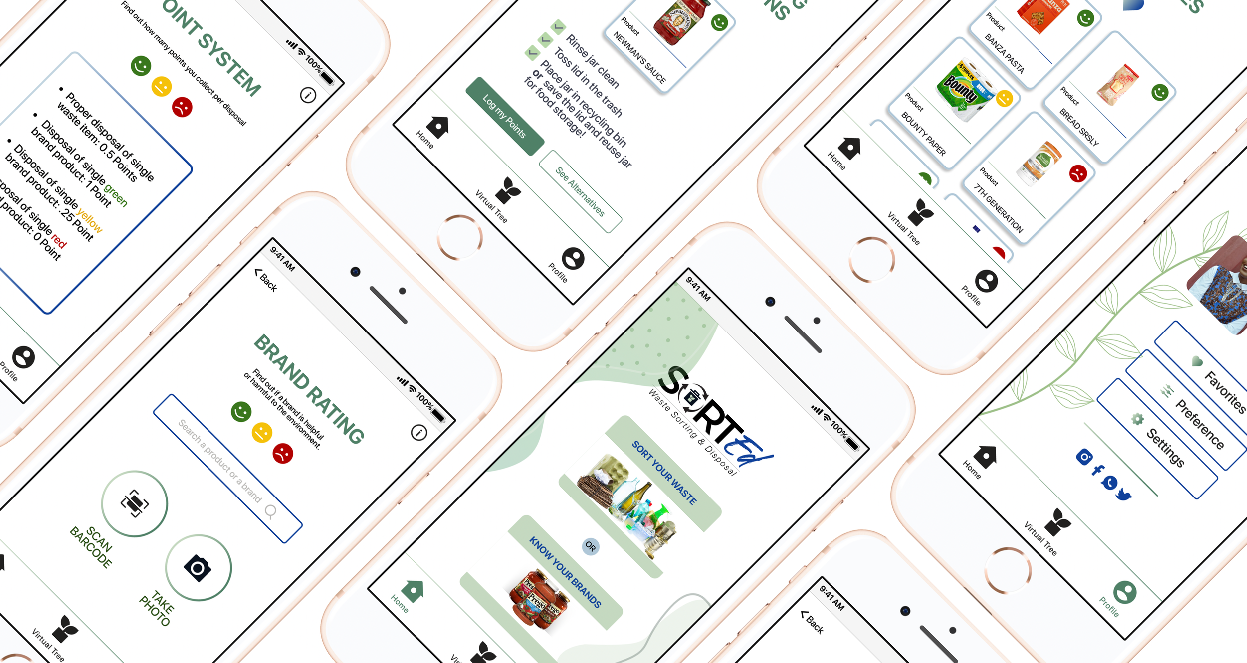
HOMEPAGE
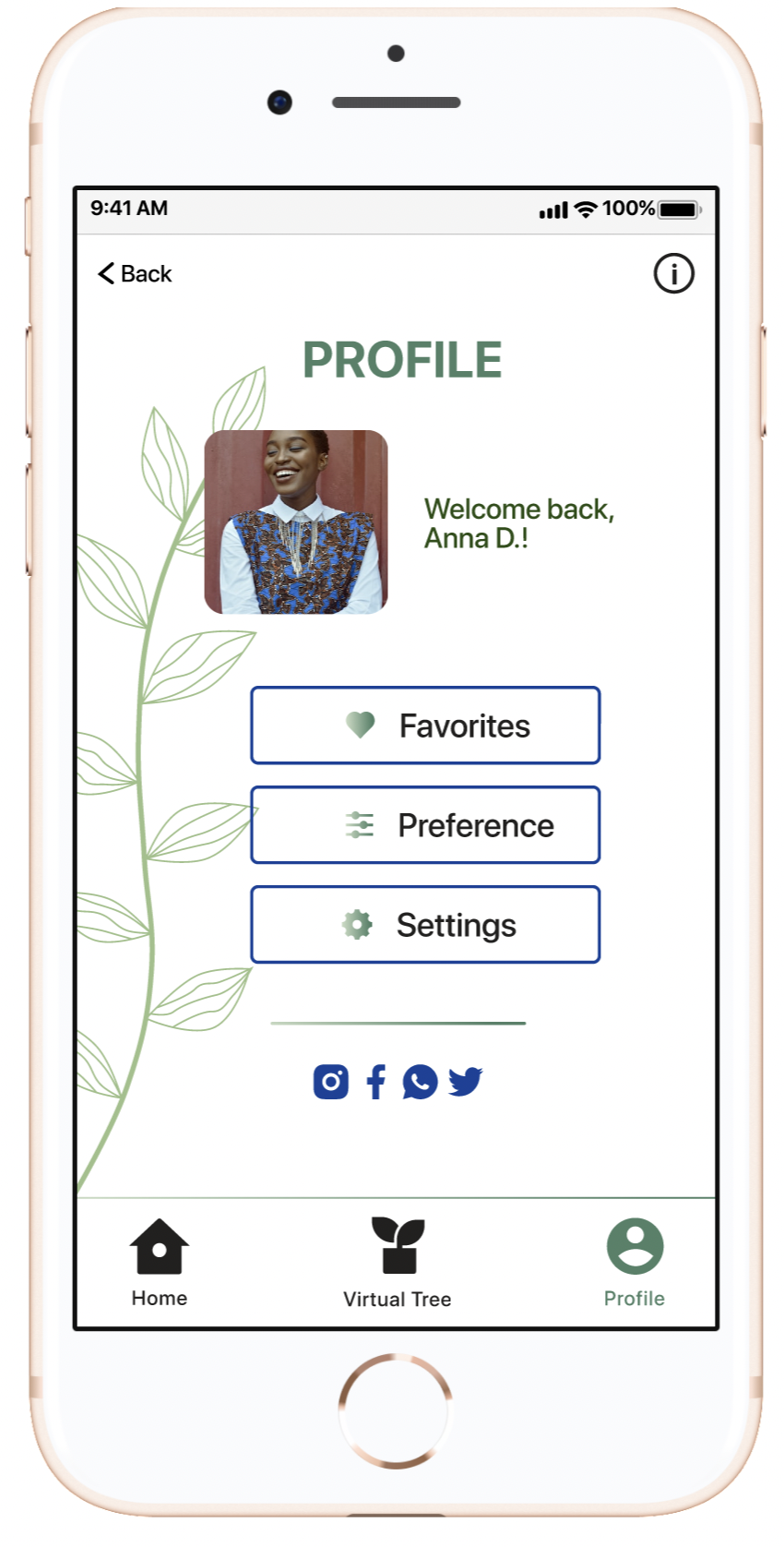
PROFILE
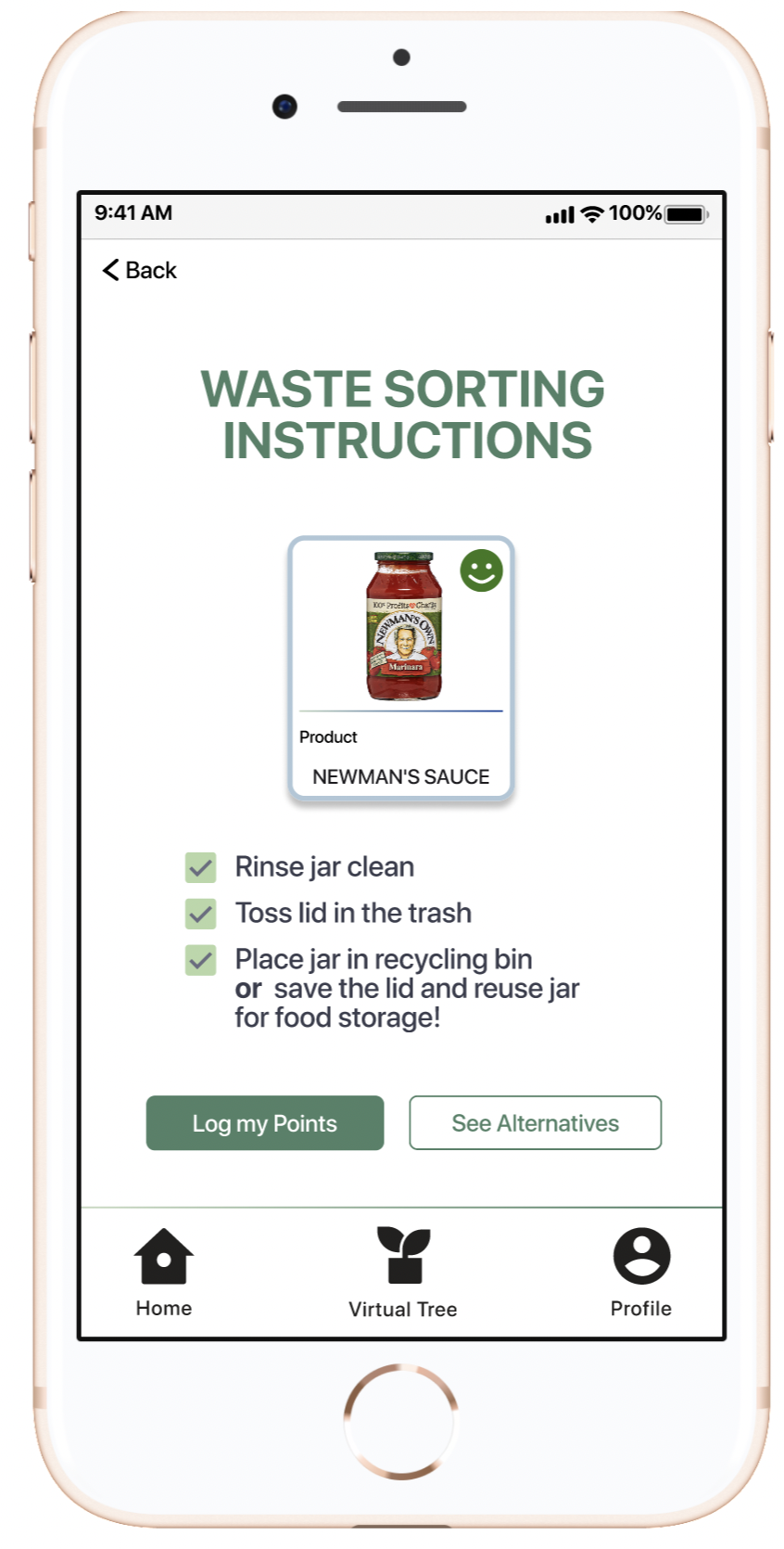
WASTE SORTING
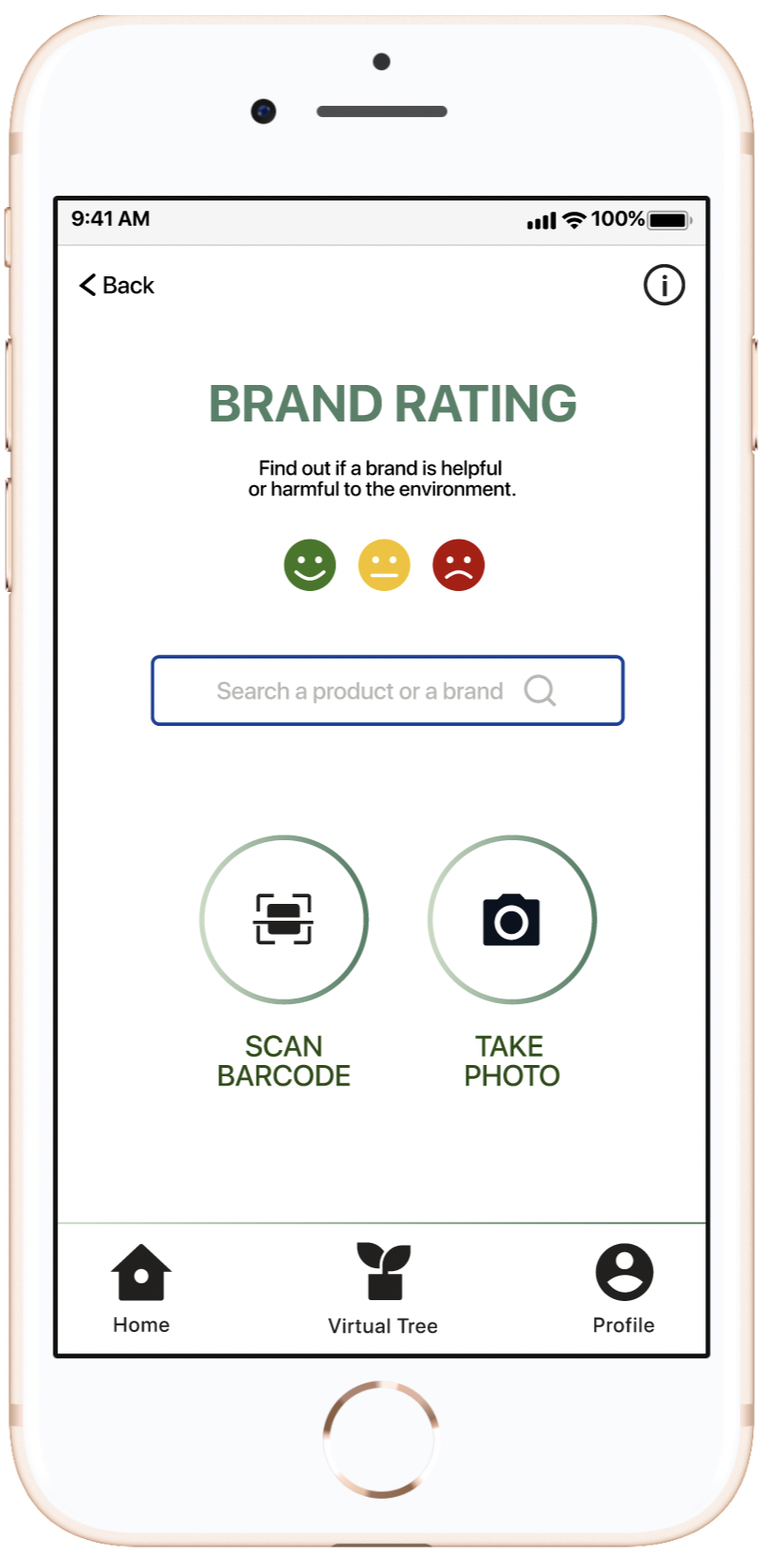
BRAND RATINGS
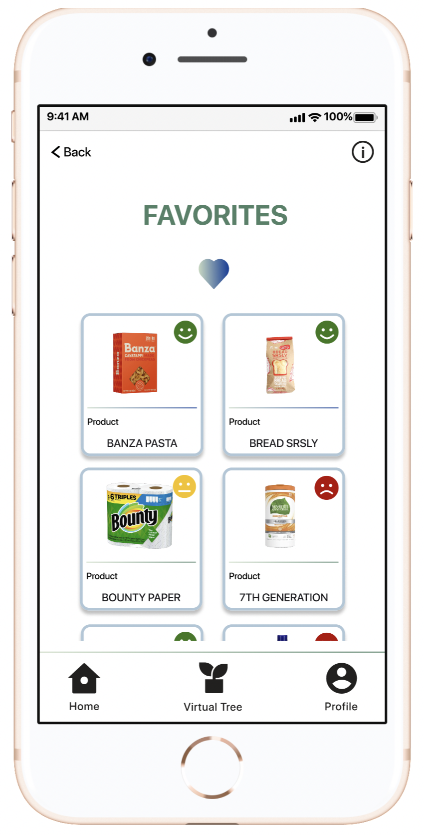
FAVORITES
Working on a real-life problem that many people face nowadays. I personally learned a lot about waste sorting and disposal during this project. Some of the learnings I took away from this exercise :
There’s always room for more iterations: Apart from improving user journeys, frequent testing and incorporating the feedback into my designs helped me get better at the underlying tools I was using too! I was getting faster and faster at incorporating feedback!
Improve Features: Even though I am satisfied with how the iterations helped me polish a lot of features and fix some flaws in their usability, I still see room for improvement. For example, I would like to include more features to give the application a social aspect, enabling users to share their progress with friends.
More Testing: I would like to also advertise my prototype across various platforms in hopes of accumulating more feedback from user testing. I think this will help identify any drawbacks in the current state of my design, further optimize my user flows, and help me prioritize new features and user flows.
