

Amplify.UX
Platform: Web, Chrome Extension
Role: UX Designer.
Tools: Figma, Notion, Adobe Creative, Google Suite.
Timeline: 12 weeks
Screens Produced: 46+
Process: Research, Ideation, Prototyping, Testing. Repeat.
OVERVIEW
Scope
Amplify.UX is a mental well-being tool designed to support job seekers through stress management and resilience-building resources.
Process
I conducted market research and user interviews to understand the mental wellness needs of job seekers. Using this insight, I developed personas and mapped user journeys to identify critical touchpoints. With Figma, I crafted wireframes and interactive prototypes, then conducted iterative testing with real users to refine interactions, ensuring a supportive, wellness-focused UX tailored to the job search experience.
Solution
I conceptualized, designed, and tested a mental well-being tool for job seekers to navigate the emotional challenges of the job search process. The solution incorporates positive psychology principles to foster mental resilience, support connections with like-minded individuals facing similar hurdles, and provide career advice and wellness activities. This approach aims to enhance users' well-being while enabling meaningful professional growth and support.
the problem

Navigating the Mental Health Challenges of Job Searching
In today's tough job market, many seekers face mental health struggles due to limited opportunities and unrealistic requirements.
This leads to decision fatigue, overwhelm, and burnout.
Accessing professional mental health support is often costly, making it harder for the unemployed to get the
help they need.


the SOLUTION

EMPOWERING JOB SEEKERS THROUGH POSITIVE PSYCHOLOGY AND CONNECTION
Developing a solution that integrates positive psychology to support mental wellbeing and facilitate meaningful professional connections, people who who have faced similar challenges, offering career advice and activities to enhance mental well-being
Target Market: United States
Main Target Audience: Job Seekers
Stage: Proof of Concept


how might we…

Support discouraged job seekers in easing the negative effects of a challenging job search process and foster their mental well-being?


key final results
Social connections linked to motivation, confidence, and sense of belonging
As of today, based on data gather with our target users during testing, we can be 95% confident that:
-
Users expressed a strong need for 1:1 connections with peers and mentors to gain a sense of belonging and support throughout their job search journey.
The Social Connections feature was particularly appealing, with the real-time interaction aspect and fast response times, leading 9 out of 10 users to show interest in adopting it.
Although many users were unfamiliar with browser extensions, some were open to the idea of Social Connection as an extension, recognizing the potential value it could bring to their job seeking experience.


of our users will find value in Feature A: Social Connection
-
User found the concept of community letters interesting but could not envision a strong use case for the product (as an app or an extension).
We identified two types of users (active and passive).
Users prefer genuine user experiences with actionable tips over curated content.


of our users will not find value in Feature B: Kind Words
FUTURE UI ENHANCEMENTS
Design system
As the team lead for for the Social Connection Feature, I identified key opportunities for enhancing the UI, specifically to bring this feature to a high-fidelity standard.
If given more time, my focus would be on refining visual elements, enhancing interactivity, and polishing the overall user interface, and re-testing to gain more insights from users.
Here's a preview of the design system I've created, which includes styling specifications, component libraries, and interaction patterns aimed at streamlining design and development for a unified user experience.

FINAL SCREENS
Sets a welcoming tone, reinforcing the brand’s identity and guiding users to personalized recommendations based on their interests.
The Onboarding Screens


Screens that provide the core interaction points for users to engage with the platform and help mitigate users pain points.
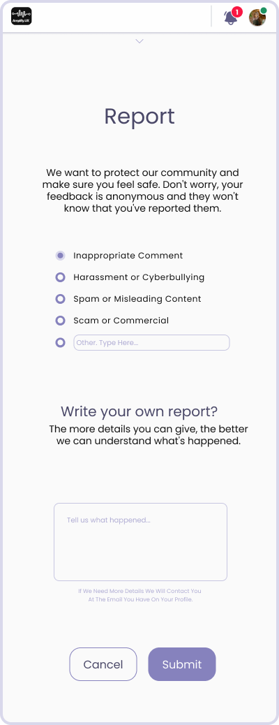
To enhance the platform’s responsiveness and accountability, ensuring users have a voice and a safe space for interaction.
The Feedback and Report screens


The tutorial flow guides users through the platform step-by-step, introducing key features and actions visually on each screen.
Screens that serve as key touch points for users to access and manage their account within the app.
Login, Signup, Settings, Profile Screens


Tutorial Flow


Home, Social Connection, Chat Screens
lessons learned
REFLECTING FORWARD
Mitigating Biases
Demographic Bias: With With 83%participants being female, our findings may be biased. Future research should include a more diverse group for broader insights to help mitigate biases.
Research Methodologies: Adapting research methods can better capture diversity and address potential gaps.
Features to Explore
Self-assist tools for taking breaks during the job search.
Time management and goal-setting features for self-regulation.
Daily check-ins to support ongoing self-regulation and motivation.
Personal Learnings
I've learned the importance of challenging and questioning initial assumptions, especially when they don't align with user needs.
By advocating for what truly benefits users, I've discovered that it's possible to pivot, explore new ideas, and make decisions that lead to a stronger user-centered design that delivers value.
MORE PROJECTS

PawVoyager
